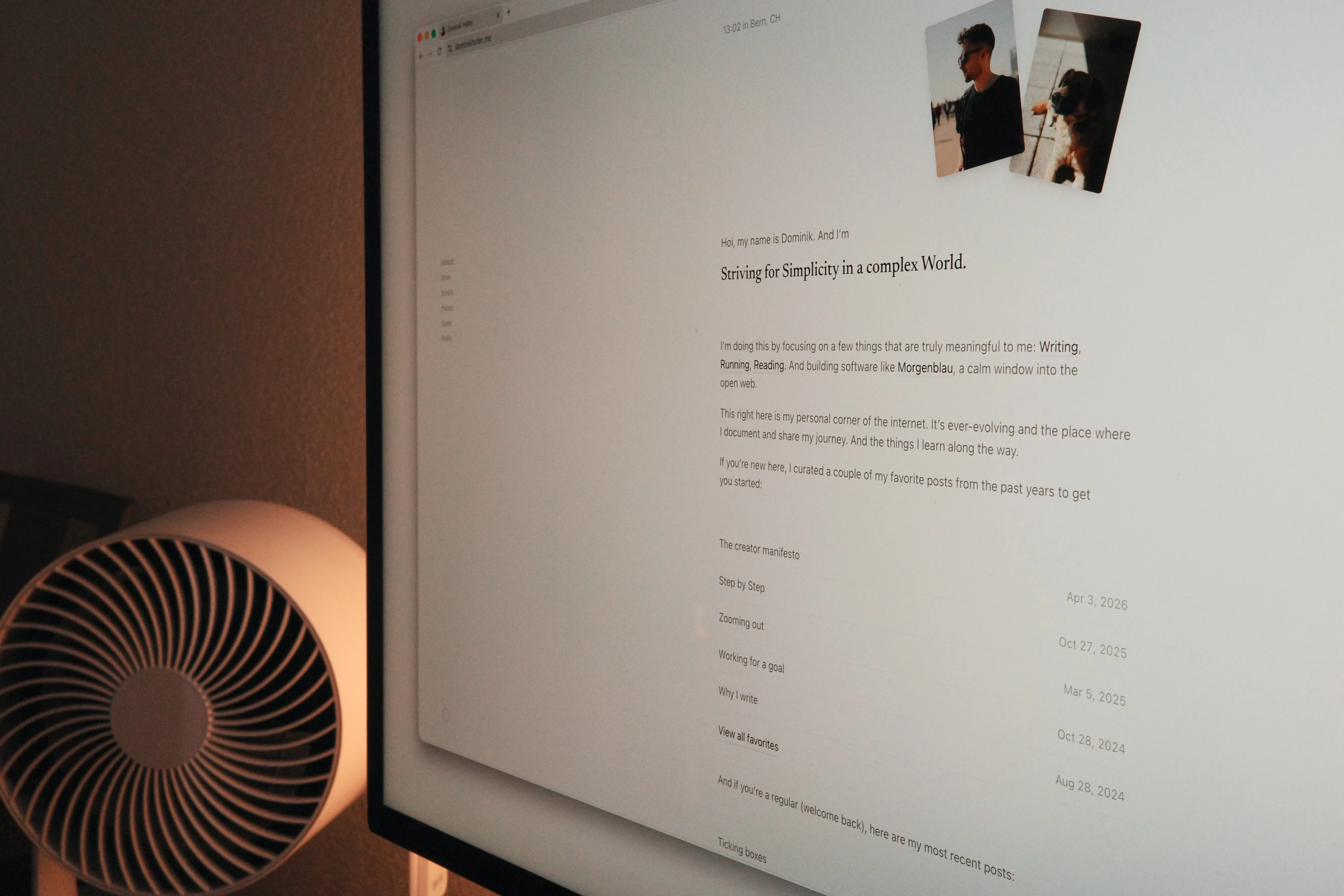
Back in January, I started an experiment by turning this website into a social media timeline-like experience. But now, we’re back to the roots.
I like how each iteration of my personal website tells a different story. It’s a snapshot of how I wanted to represent myself online at the time of creating it.
With the first version, I mainly wanted a place where people could find me, learn more about me, get into writing regularly, and where I can showcase my work and photography.
Afterwards, I dove more and more into the IndieWeb and started thinking about how a personal website can replace social media profiles while still feeling up-to-date and casual. That was the next iteration, version two.
But when looking at this second version, I felt like there was a disconnect between the vision of the website and who I am. The website felt cramped, there was too much going on, quick link share posts mixed with long-form content. It was a cool concept, a bit of everything, but not what my home on the internet should be.
What I want people to feel when they visit my website is that it’s a space to breathe and a pause from the busy rest of the internet. A place to explore on their own terms and find interesting things.
That’s why my writing is now at the core of this website. Right on the home page, you see a curation of my personal favorites to get you started (as a new visitor) or the latest posts (if you’re returning). The writing is the living part of this website and what makes it unique. The website itself should be the stage and not the star of the show.
The theme of “simplification” runs deep within this website now. From the h1 on the home page to the technical choices to the design.
While I love the ethos of Kirby CMS, I felt like it was overkill for a website of my scale. I don’t need a CMS. I simply need a folder with markdown files in it that powers the whole thing1.
What I (or rather you as a reader) also don’t need are five different RSS feeds2. Now, we just have one with only my long-form post. Not a cluttered one with everything mixed in.
No short-form social media-like posts either. They encourage posting quick thoughts that sound smart but aren’t, if you sit longer with them. Writing is thinking on paper, and that can’t happen in 200-ish characters.
The photos section is gone as well. I still love taking photos (mainly on vacation), but I never regularly uploaded them to the website anyways. I might add a static section to the site someday though, where I showcase my favorite photos I took over the last few years.
All of this sounds like I only removed stuff from the site. But simplification doesn’t always have to equal sizing down. It means making things simpler.
For me. Updating my reading list or sharing interesting links (both on /now) is a breeze now, since I don’t even have to update my website for that. It happens automatically, via ATProto services I use anyways: Bookhive for tracking the books I read and Semble for collecting links.
And for you. You can now not only follow this website via the RSS feed. There is also an option to get notified via email whenever I publish a new post. Or, if you’re into ATProto and know what it is, you can follow and read the blog via Standard.site. See both options at the bottom of this post (and every other page).
I hope with this redesign, my website returns to what I originally wanted out of it: A personal home on the internet that feels truly personal.